
Your website is one of the most powerful ways to express your brand, and when it comes to Showit templates, the beauty is that they’re built for customization. But the design only really comes alive when your branding feels like you.
If you’ve been wondering how to create branding that feels intentional, professional, and aligned with your creative business—without hiring a designer—this guide walks you through the full process. You’ll learn how to:
- Define your visual direction and aesthetic
- Build a cohesive color palette
- Choose fonts that fit your brand
- Design your own logo
- Organize it all into a brand board and folder
By the end, you’ll have a complete, DIY brand identity that’s ready to drop straight into your Showit website template.
The industry standard for branding design is to use a vector-based platform like Adobe Illustrator. It’s what most professional designers rely on. But if you don’t have design experience, Canva is going to be your best friend. It’s intuitive, flexible, and makes it completely possible to design a polished, cohesive brand on your own.
So, in this post, we’ll be working inside Canva to walk through every step.
Step 1: Get Clear on Who You’re Trying to Attract
Before you start choosing colors or fonts, take a minute to think about who your brand is meant to connect with. Your visuals should reflect both you and the kind of people you want to draw in.
Start by asking yourself a few grounding questions:
- Who are my dream clients or customers?
- What do they value or look for when choosing someone to work with?
- How do I want them to feel when they land on my site?
- What kinds of brands, visuals, or moods are they already drawn to?
Then, shift the focus inward. Ask:
- What am I personally drawn to?
- What colors, textures, or visuals feel most like me?
- What parts of my creative style or personality do I want to show through my branding?
The goal here is to find the sweet spot between who you are and who you want to attract. When your branding reflects both, it naturally feels more authentic and magnetic.
For example, maybe you’re a photographer who loves moody, earthy tones and works with couples who crave adventure and intimacy. Or maybe you’re a copywriter who’s drawn to soft neutrals and elegant typography because you want to attract calm, intentional creatives.
Once you define this connection point, every design decision that follows — from your colors to your fonts — becomes a lot easier and more meaningful.ct with. Your branding should feel like you but also speak directly to the people you want to work with.
Step 2: Gather Inspiration on Pinterest
Once you have a sense of direction, it’s time to get visual. Head to Pinterest and start creating a mood board that captures your aesthetic. Think color palettes, textures, typography or fonts, and photography styles.
Pin anything that you’re naturally drawn to or that holds meaning for you. For example, if you’re someone who loves nature (like I do), you might pin ferns, sunsets, mountain views, or ocean tones. Those subtle details say a lot about what you value and what inspires you, and they’ll help your branding feel more like you.
As you keep pinning, you’ll start to see patterns—colors, moods, and textures that repeat themselves. That’s your visual direction starting to show up.
(Tip: Follow The Kindling Studio on Pinterest for nature-inspired, editorial web design inspo.)
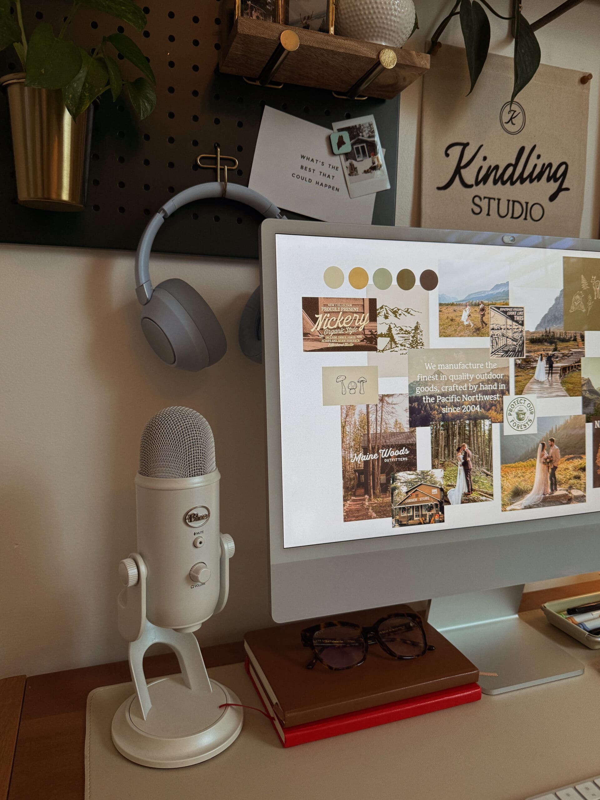
Step 3: Create a Mood Board in Canva
Next, open Canva and drop in your favorite pins. Think of this as your visual compass, the north star for everything you design next. You’ll start to see your brand personality come to life right on the page.

Step 4: Build Your Color Palette
From your mood board, start pulling colors that feel aligned. You can use Canva’s color picker tool to pull tones straight from your images.
Here’s a good starting point:
- 1–2 primary colors: your main brand tones
- 2–3 secondary colors: supporting tones, neutrals, or background colors
- 1 accent color: something bold or fresh to add energy
Try to have a range of light and dark colors. Having both gives you flexibility when designing. Darker shades can work as backgrounds, while lighter ones can make great text or overlays. This contrast helps your designs feel more balanced and versatile across your website, social posts, and graphics.
Once you’re happy with your colors, write down the hex codes (those six-digit color numbers) so you can use them consistently.
Step 5: Choose Your Fonts
Your fonts are one of the biggest pieces of your visual identity. They instantly set the mood of your brand and can completely change how your website feels.
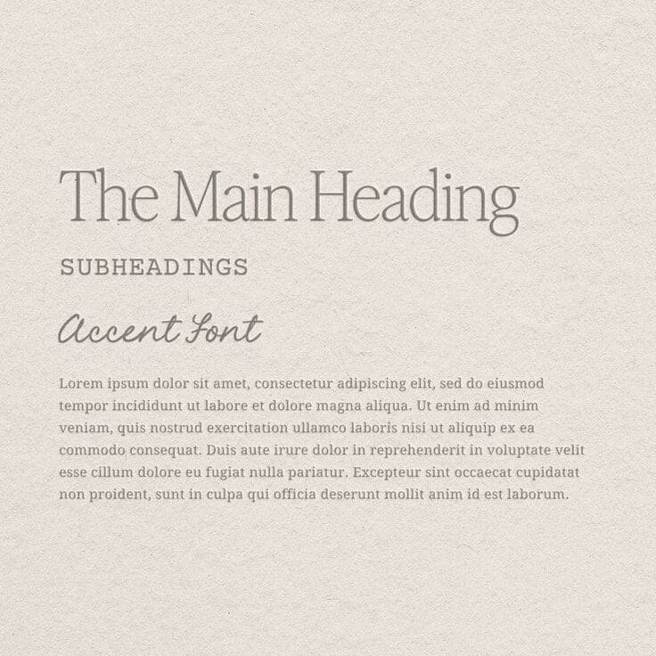
Understanding Font Hierarchy
Before you start hunting for fonts, it helps to understand font hierarchy—how different fonts work together and what purpose each one serves. This structure keeps your brand looking consistent across everything you design.
Here’s a simple breakdown:
- Header font: Your statement font; it grabs attention and sets the tone.
- Subheader font: Smaller and simpler; supports your header and helps organize content.
- Body font: Clean and easy to read. This is the one you’ll use for paragraphs and details.
- Accent font (optional): Adds personality and works for small highlights, quotes, or callouts.
Once you know what roles you need to fill, it’s easier to choose fonts that complement each other.
Choosing Fonts That Fit Your Brand
Here’s a quick rundown of font styles and what they communicate:
- Serif fonts (like Playfair Display or Libre Baskerville): timeless, editorial, and classic.
- Sans-serif fonts (like Poppins, Lato, or Helvetica): modern, clean, and minimal.
- Script fonts: handwritten or cursive; add personality and softness—use sparingly.
- Display fonts: bold, decorative, and unique; best for headlines or logos.
Font-Pairing Tips
- Decide on your tone. Are you going for refined and elevated, or simple and down-to-earth?
- Use contrast. Pair one font with personality and one that’s clean and neutral.
- Keep readability in mind. Your body font should be legible on all devices.
- Stick to 2–3 fonts total. Headline, body, and optional accent—that’s plenty.
If you want something a little different, Creative Market has beautiful, high-quality fonts. You can also browse Google Fonts or Adobe Fonts for free, easy-to-use options.
Step 6: Design Your Logo
Now it’s time to bring everything together and create your logo.
If you want a professional starting point, grab The Trailblazer Logo Kit from my Template Shop. It’s built for creatives who want to design a logo in Canva without starting from scratch.
Understanding the Basics: What Makes a Good Logo
At minimum, try to have two logo versions:
- A primary logo (your main logo)
- A brand mark (a simple icon or smaller version)
Your primary logo is the one you’ll use most—on your website, business cards, and marketing materials. This can be as simple as a wordmark, which is your business name styled in your chosen font, or it can have a little extra personality with a small illustration or icon that ties into your brand, like a sun, leaf, or abstract line shape.
Your brand mark (sometimes called a submark or monogram) is a smaller, simplified version of your logo. It might be your initials or an icon pulled from your main design. It’s perfect for favicons, social media profile images, and watermarks where you need something compact but recognizable.
Logo Design Tips
- Keep it simple; minimal always looks more polished.
- Test stacked and horizontal layouts.
- Make sure it’s clear at both large and small sizes.
- Stick to your color palette.
- Give it breathing room; whitespace is your friend.
Quick note on Canva licensing:
If you’re creating your logo in Canva, make sure to double-check Canva’s licensing terms before using any of their fonts, graphics, or illustrations in your final logo. Some Canva Pro elements aren’t licensed for logos. It’s safest to stick to your own shapes, use Canva’s free elements, or grab licensed ones from Creative Market.
Step 7: Create a Brand Board in Canva
Once your logo, colors, and fonts are ready, pull it all into a brand board. It doesn’t have to be fancy—just a single page that lays out:
- Your logo (primary + secondary versions)
- Your color palette (with hex codes)
- Your font hierarchy (headline, subhead, body, accent)
- A few brand imagery examples or textures
This becomes your go-to visual reference for everything, from designing Instagram graphics to customizing your Showit template.
Step 8: Keep It Organized
Save all your branding files in one dedicated folder: your logos, fonts, mood board, and brand board. Future you will be so grateful when you’re not hunting for that one hex code or font file.
When saving your logo files, make a few color variations so you’re ready for any background:
- White version (for dark backgrounds)
- Light version (use your lightest brand tone, like beige or off-white)
- Dark version (use your darkest tone, like deep green or charcoal)
That way, no matter where your logo ends up—on your site, social media, or packaging—it’ll always look clean and intentional.
Step 9: Customize Your Showit Website Template
Once your branding is done, you’re ready to customize your Showit website template. Having all your visuals organized makes the whole design process smoother and way more fun.
If you’re still searching for the perfect fit, check out The Kindling Studio’s Template Shop, built for creative entrepreneurs, photographers, and small studios who want that warm, elevated, nature-inspired look.
And if you don’t have Showit yet, you can sign up here to get your first month free.
Final Thoughts
DIYing your brand might sound intimidating, but it’s such a fun and empowering part of building your business. When you ground your design choices in who you are and who you want to attract, you’ll end up with branding that doesn’t just look good—it feels like you!
That said, if you reach a point where you’re ready for a designer to step in and take things to the next level, I’d love to help.
If you already have a Showit template and want it customized for you, my Ignite Intensive is a done-for-you template customization experience where I also offer an optional mini branding kit add-on. It’s the perfect fit if you want to skip the DIY process and have your branding handled for you.
And for anyone ready for a full transformation, my Essential Stack package is designed for you. It’s a complete brand identity and semi-custom Showit website, created in just two weeks.


