
Your photography website isn’t just a digital gallery it’s your online home.
It’s where dream clients decide whether your work feels right for them.
And while stunning photos are the backbone of your site, good web design is what turns admiration into action. A well-designed website doesn’t just look professional it builds trust, tells your story, and makes potential clients feel connected to you before they ever hit “inquire.”
Whether you’re DIYing your site with Showit or preparing for a full redesign, these tips will help you design a photography website that does more than look good it books.
Start With Clarity, Not Complexity
You’ve got seconds to make an impression so make sure your message is clear the moment someone lands on your site.
→ What kind of photographer are you?
→ Where are you based?
→ Who do you serve?
Those three details should be front and center on your homepage — ideally in your headline or first section.
Example:
“Elopement & Adventure Wedding Photographer based in New England capturing love stories that feel like home.”
It’s simple, specific, and instantly tells your audience they’re in the right place.
💡 Pro Tip: If your website still opens with “Welcome to my site!” it’s time for an upgrade.
Lead With Emotion, Not Just Aesthetics
Your photos already show your skill your website should show your personality.
The photographers who book dream clients don’t just display their work they make visitors feel something.
→ Add storytelling captions under galleries.
→ Share a short personal intro on your homepage (“I’m here for the couples who…”)
→ Use copy that sounds like you, not a corporate brochure.
Example:
“I’m here for the barefoot vows, the post-ceremony beers, and the kind of love that doesn’t mind a little wind in its hair.”
It’s these personal touches that make your brand magnetic.
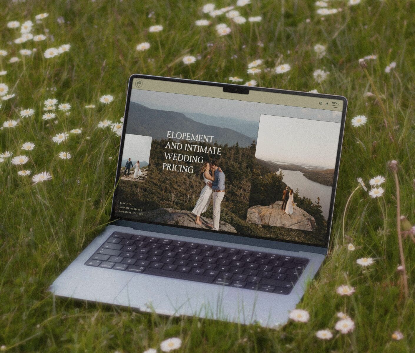
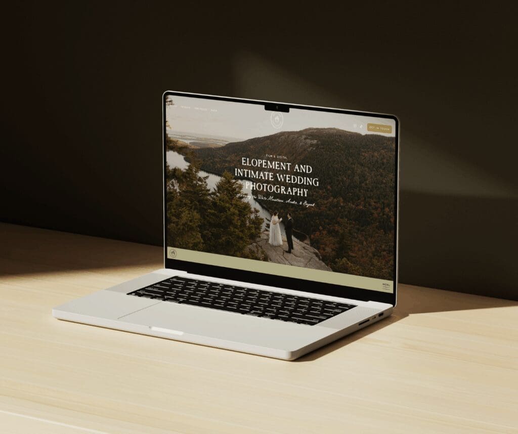
Want to see what that looks like in action? Take a peek at Hattie Mae Photography’s website — a custom Showit design I created to reflect warmth, adventure, and ease. It’s proof that intentional design can still feel effortless.
Curate, Don’t Cram
You don’t need to show everything.
Your website isn’t your hard drive it’s your highlight reel.
Choose 3–5 galleries that best represent your ideal work and clients. If you want to attract more coastal elopements, don’t lead with ballroom weddings.
In Showit:
→ Keep galleries clean and minimal.
→ Use whitespace to give your photos room to breathe.
→ Try adding text overlays or short blurbs about the shoot for context.
💡 Pro Tip: If you’re using a Kindling Studio Showit Template, try rotating your featured gallery every season it keeps your site feeling fresh without a full redesign.
Copy That Connects
Photographers often put all their energy into visuals and forget the copy but your words are what make people trust you.
Focus on connection over cleverness. Write the way you’d talk to a client on a call.
Quick Copy Wins:
→ Speak directly to your dream client (“You deserve…” instead of “I offer…”)
→ Share your approach (“Here’s what working together feels like…”)
→ Add micro-CTAs throughout (“See full gallery,” “Inquire here,” “Learn more”)
And always end with a confident, human call to action:
“Ready to make something beautiful together? Let’s plan your story.”
Design for Flow, Not Just Looks
Your website should guide visitors not overwhelm them.
Each page should have a clear purpose and flow naturally into the next.
Here’s a simple path that converts well:
Homepage → About → Portfolio → Services → Contact
In Showit, use consistent navigation and keep buttons easy to find.
Don’t hide your contact info or pricing transparency builds trust.
💡 Pro Tip: If you’re overwhelmed by where to start, try Showit — it’s a drag-and-drop website builder made for photographers and creatives who want total freedom without code. You can also explore templates built just for photographers in the Kindling Studio Template Shop.
Make Your Site Feel Like You
Trends come and go authenticity doesn’t.
Your website should reflect you and the kind of experience you create.
→ Choose fonts that match your energy — elegant, modern, playful, or timeless.
→ Use color intentionally: soft neutrals for warmth, deeper tones for drama, light tones for romance.
→ Include brand elements like your logo variations, hand-drawn icons, or subtle textures to make it feel cohesive.
Showit makes it easy to customize these details so your site doesn’t feel like “just another photographer’s website.” It feels like yours.
Make It Easy to Inquire
This might sound obvious, but it’s one of the biggest mistakes I see photographers hiding their contact form behind too many clicks or not personalizing it.
Your inquiry page should:
→ Be accessible from every page.
→ Include a brief welcome message or “what to expect.”
→ Feel friendly, not transactional.
Example:
“Ready to chat details? Fill out the form below and I’ll be in touch within 24 hours can’t wait to hear your story.”
Bonus points if your form matches your brand tone (no all-caps or robotic language).
Keep It Simple and Keep It Moving
The best Showit websites don’t try to do everything.
They guide, connect, and inspire action.
Once your site feels aligned with your brand and your dream clients, don’t overthink the rest. Hit publish. Test it. Share it.
Websites evolve and that’s a good thing.
Final Thoughts
Your website is your online handshake the moment where your art meets your audience.
When you design with clarity, connection, and intention, you don’t just get clicks — you get clients who already feel like they know you.
If you’re ready to create a Showit website that actually feels like you, explore Kindling Studio’s Showit templates built with photographers in mind, and designed to help you launch with ease, confidence, and alignment.
Or if you’re craving something custom, inquire about brand and web design because your work deserves a digital home that does it justice.
Affiliate Disclosure
This post contains affiliate links for Showit. If you sign up using my link, you’ll get your first month free — and I may earn a small commission at no extra cost to you. I only share tools I truly love and use in my own business.


